
Juan Gris
He is a Spanish artist he works with what looks like pastels and paint oil. His work is very abstract and looks very interesting i like his style as it is abstract and i like to work that way in my work also, he uses a lot of sharp shapes in his work which create a intriguing look about them. He also sticks to a lot a Grey's, Whites and browns which are very natural colours (and monochromatic). I find his work interesting and inspiring for me as i like to work in his style using many shapes and using monochrome.
David Hockney

As you can see David Hockney works in a very similar style to Gris as he uses many shapes to create his images which i find very skilled to complete as his pictures and Gris's are very complex. Also, Hockney creates paintings as well as photo montage designs as you can see his paintings look very realistic and he is a very talented painter. Overall, i find his work very inspiring as he is very similar to Gris such as his style of work shapes and realism.
A2 Mixed media piece - development


I used p.v.a to stick my skyline view down.
Also i cut out my mono prints more carefully with a scalpole to get a more neater and clean edge.


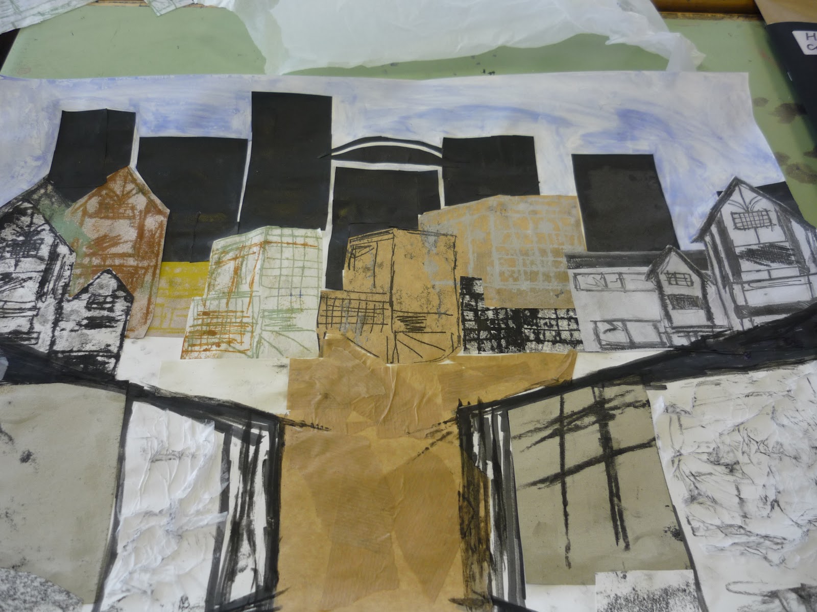
This is my final outcome as you can see i have made the gates there if i want them as houses i can always come back and work on it. I am going to develop this further on Tuesday by sketching more into it such as the building and improve on the backdrop.
2nd Mixed media piece


Materials used for my mix media:
Block printing
tissue paper / black and white
emulsion white and black = grey
brown paper
indian ink
chalk white.
Overall, i am pleased with what i have created today and have used many techniques and processes in my work i can come back and make a few adjustments however, i like the way it looks and how i have worked around one image from college to make a imagine landscape.
Lyonel Feininger

Lyonel was a German / American artist who become one of the best known and admired contributors to the cubist and expressionist schools of art in the early 20th century.
for twenty years he worked as an illustrator and cartoonist for newspapers and magazines both in germany and the united stated
His work is very interesting and relates a lot to the work that we have been doing with landscapes and buildings and also using mixed media with layering up shapes and and buildings together.
I really like his work as it is abstract and very unusual also his uses neutral colours instead of bright which heightens realism.
My relief prints


I wanted quite abstract shapes as i like working this way with my work. I used Charcoal and Block printing ink.


As you can see i have started with light blue colours the worked my way up to more greener colours then moving on to the earthy colours such as browns and dark oranges like muddy colours as my scene would look better like this.
In my work i used mostly all of my colours in my wash using the lighter colours around the piece then working in with darker colours.
 Lighter - Dark.
Perspectives - watercolours & evaluation
This is my perspective piece that i created using my
colour washes and guide lines for perspective.
As you can see i have created a tunnel that i wanted to look abandoned so i painted my background and the main tunnel using water colours and emulsion then when i had completed that i then painted some trees and over grown grass and graffiti to give the effect of abandoned.
Overall, i feel i have done well with my water colour painting as i followed my swatches well. Also, i didnt want to do buildings as i have done buildings 3 time using mixed media so i wanted to do some think related to inside.
Pegi ratings and Symbols

The Pegi ratings appear on the front and back of games packaging indicating one of the following age levels: 3, 7, 12, 16, 18. They provide a reliable indication of the suitability of the game content in terms of protection of minors. The age rating dos not take into account the difficulty level or skills required to play the game.
Game Environments

Here are some different game environments that i have looked at for different ideas on my landscapes.
No comments:
Post a Comment